
How To Choose The Perfect Relaxing Colour For Bedroom Bliss: A Step-by-Step Guide
Did you know that over 40% of the UK population suffers from sleep issues? While mattress ergonomics and nighttime routines play key roles, your visual environment has a far greater impact on sleep architecture than you might realize.
Pairing high-quality bed linen with upgrading to a supportive mattress from Bedstar can gain you up to an extra 42 minutes of sleep per night, creating a solid physical foundation for rest. When you combine high-quality bedding with a scientifically backed, relaxing colour scheme, you create an environment engineered for deep rest.
Whether you are drawn to muted sage greens, warm earthy neutrals, or deep, enveloping blues, this step-by-step guide explores the science of colour psychology, highlights shades to avoid, and walks you through choosing the ideal paint palette for your sanctuary.
1. The Neuroscience of Colour and Sleep Architecture
Visual hues do far more than define room aesthetics—they directly influence human emotion, nervous system activity, and biological rhythms.
The Ocular-Hormone Feedback Loop
| Cool Spectrum Light (~490 nm) | Ganglion Cell Detection |
|---|---|
| • Muted blue & sage green wavelengths
• Reflected off matte wall surfaces |
• Retinal ipRGCs process light signals
• Transmits electrical cues to Hypothalamus |
| Melatonin Production | Cortisol Reduction |
| • Triggers sleep onset | • Lowers blood pressure |
How Wall Hues Regulate Hormones
Your emotional state before turning off the lights directly dictates sleep efficiency. Studies show that negative emotions and visual overstimulation lead to delayed sleep onset—a major factor in how elevated stress affects sleep duration across UK households.
- Retinal Ganglion Cells (ipRGCs): Specialised photoreceptors in your eyes are uniquely sensitive to blue wavelengths (around 490 nanometres). When these cells detect soft blue or cool green tones, they send signals directly to the hypothalamus—the brain’s control centre for circadian hormones.
- Melatonin vs. Cortisol: Exposure to cool, low-saturation shades signals the brain to increase melatonin (the sleep hormone) while lowering cortisol (the primary stress hormone).
- Thermal Perception: Cool-toned blues and greens reduce physiological arousal and create the optical perception of a cooler ambient temperature, encouraging the natural drop in body temperature needed for deep sleep.
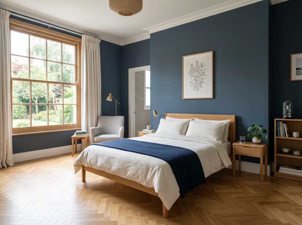
Pictured: An interior photograph of a peaceful master bedroom suite. The feature wall behind the bed is painted in an ultra-matte, deep slate blue with subtle warm undertones.
2. The Best Colours for Restful Sleep
Colour Category and Sleep Impacts
| Colour Category | Avg. Nightly Sleep Duration | Primary Psychological & Biological Effect |
|---|---|---|
| Soft & Dark Blues | 7 hours, 52 minutes | Max. melatonin release; reduced heart rate |
| Sage & Forest Green | 7 hours, 36 minutes | Lowered cortisol; reduces anxiety & stress |
| Earthy Neutrals | 7 hours, 12 minutes | Low visual noise; calming & grounding |
| Dusky Pink/Lavender | 7 hours, 08 minutes | Nurturing warmth; relaxes nervous system |
| Dark Brown | 6 hours, 05 minutes | Gloomy atmosphere; fosters isolation |
| Saturated Purple | 5 hours, 56 minutes | Overly stimulating; vivid dream cycles |
1. Soft Blues, Inky Navies, and Teals
Blue is consistently proven to be the most effective colour for sleep. In a landmark Travelodge sleep study of 2,000 UK homes, respondents in blue bedrooms logged an average of 7 hours and 52 minutes of sleep per night.
Expert Paint Tip — Deep Blue Depth: Colour specialist Annie Sloan recommends opting for deeper, richer blues rather than icy pastels. Inky navies or rich jewel-toned blues with subtle green undertones eliminate visual “noise,” creating a secure, cocoon-like atmosphere as night falls.
2. Restorative Sage and Forest Greens
Green connects us instinctively to nature. Research from the gardening and wellbeing charity Thrive demonstrates that exposure to natural green tones significantly lowers physiological anxiety and stress levels.
- Sage Green: Subtle grey undertones make sage an easy-to-use, peaceful choice that works across traditional and modern spaces.
- Forest Green: Adds depth and understated luxury without feeling cold or clinical.
3. Warm Earthy Neutrals
Warm beige, soft taupe, pebble grey, and sand offer peaceful alternatives to bright white. Pure, stark white can feel clinical under evening lamplight, whereas warm neutrals provide visual whitespace while keeping the atmosphere welcoming.
4. Dusky Pinks and Soft Lavenders
- Blush & Muted Terracotta: Introduce gentle warmth and comfort without the stimulating effects of bright red or orange.
- Pastel Lavender: Sits on the cool end of the purple spectrum, offering proven mind-clearing properties that help quiet racing thoughts before sleep.
3. Colours to Avoid in the Bedroom
Shades to Avoid
| High-Stimulation Tones | Depressive / Vivid Tones |
|---|---|
| • Crimson Red & Coral Orange (raises heart rate) | • Dark Brown (promotes gloominess) |
| • Acid Yellow & Neon Tones (causes visual fatigue) | • Saturated Purple (triggers vivid dreams) |
- Red & High-Saturated Orange: Red elevates blood pressure and heart rate, triggering the sympathetic nervous system and delaying sleep onset.
- Saturated Royal Purple: Associated with high cognitive stimulation and creative brain activity, deep purples can disrupt sleep architecture and lead to vivid, restless dreams.
- Dark Chocolate Brown: Studies show that dark brown bedrooms yield some of the shortest sleep durations (averaging just 6 hours and 5 minutes), often creating a gloomy, heavy atmosphere.
4. A 5-Step Guide to Selecting Your Palette
Step 1: Assess Your Bedroom’s Natural Light Orientation
- North-Facing Rooms: Receive cool, bluish natural daylight. Counteract this cool cast by choosing blues, greens, or neutrals with warm undertones (e.g. sage with a touch of yellow, or warm taupe).
- South-Facing Rooms: Enjoy bright, warm sunlight from morning to dusk. Cool slate blues, crisp mints, and soft greys excel in south-facing spaces.
Step 2: Define Your Desired Evening Mood
Determine how you want the room to feel as night falls. Do you prefer an airy, bright morning sanctuary or an enveloping, dark evening cocoon?
Step 3: Perform 48-Hour Sample Testing
Never paint directly from a tin without testing first.
- Paint two coats of your chosen shade onto large A3 lining paper.
- Move the swatches across different walls over 48 hours.
- Observe how the pigment shifts under cool morning daylight, golden afternoon sun, and warm 2,700 K evening lamps.
-
The 60-30-10 Palette Rule
| 60% Base Shade | 30% Secondary Shade | 10% Accent Highlight |
|---|---|---|
| • Primary walls & ceiling
• E.g. Soft Sage Green |
• Bedding & long window drapes
• E.g. Cream Linen |
• Decorative cushions & lamps
• E.g. Muted Terracotta / Brass |
Step 4: Layer Complementary Shades
Avoid flat, single-colour rooms by applying the 60-30-10 rule:
- 60% Foundation: Primary wall colour (e.g. soft sage green).
- 30% Secondary: Drapes, bed linens, and large rugs (e.g. warm oatmeal or cream).
- 10% Accent: Small accessories, lampshades, or throws (e.g. dusky terracotta or brushed brass).
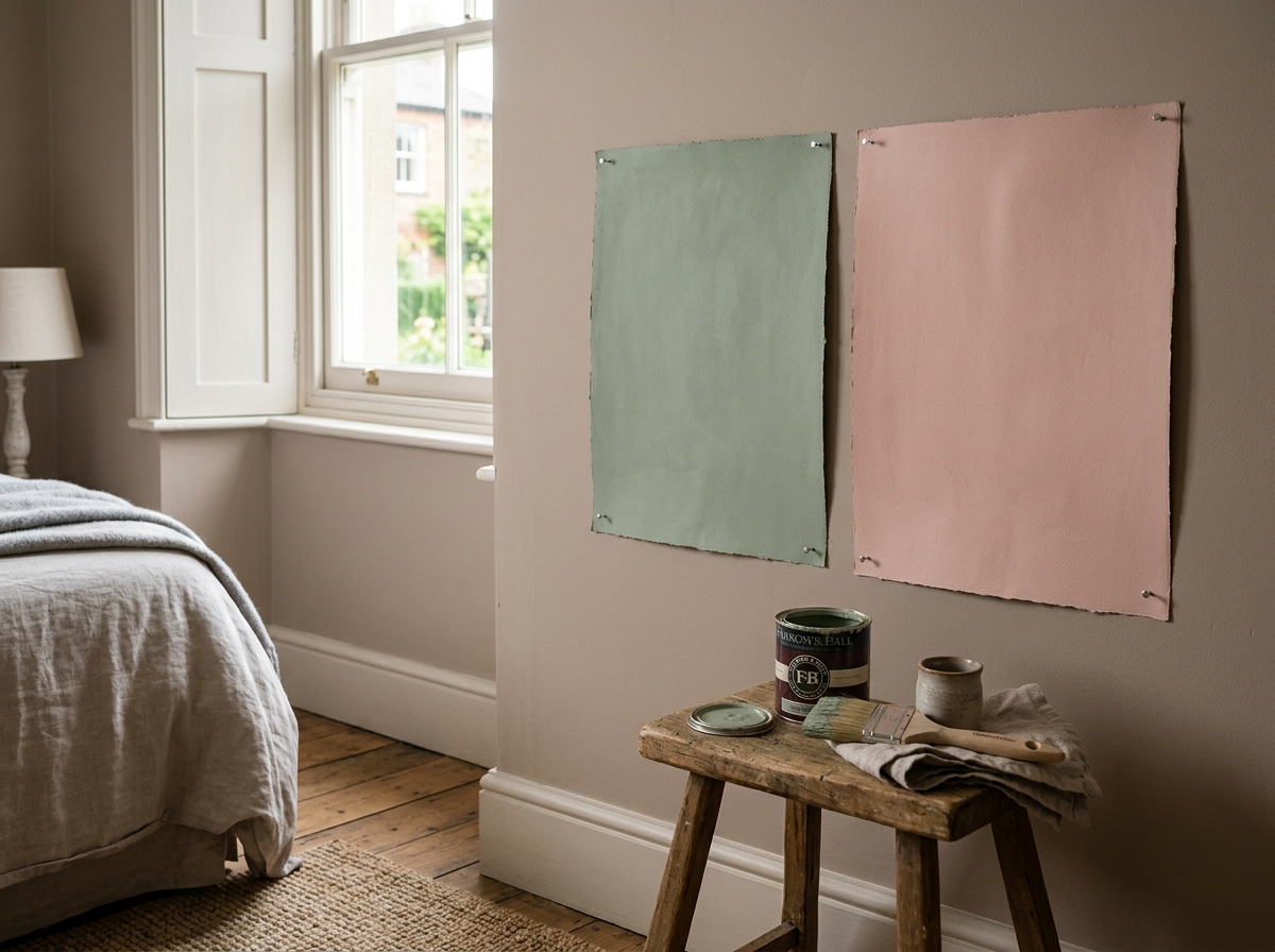
Pictured: An interior photograph focusing on a wall corner in the same bedroom suite. Two large A3 lining paper paint swatches are pinned to a soft taupe wall: one in a muted chalky sage green and one in a soft dusky pink.
5. Styling Techniques for a Restful Sanctuary
The Two-Tone Split Wall Technique
Dividing your wall horizontally creates visual interest while grounding the sleeping zone:
- The 1/3 to 2/3 Ratio: Place the colour split at either the lower third or upper third of the wall rather than dividing it exactly in half.
- Dark Base, Light Top: Apply a deeper shade (such as dark slate or forest green) on the lower third, and a soft, tinted white on the upper two-thirds.
- Extend to the Ceiling: Carrying the upper light shade across the ceiling blurs wall boundaries, making compact UK bedrooms feel noticeably higher and more spacious.
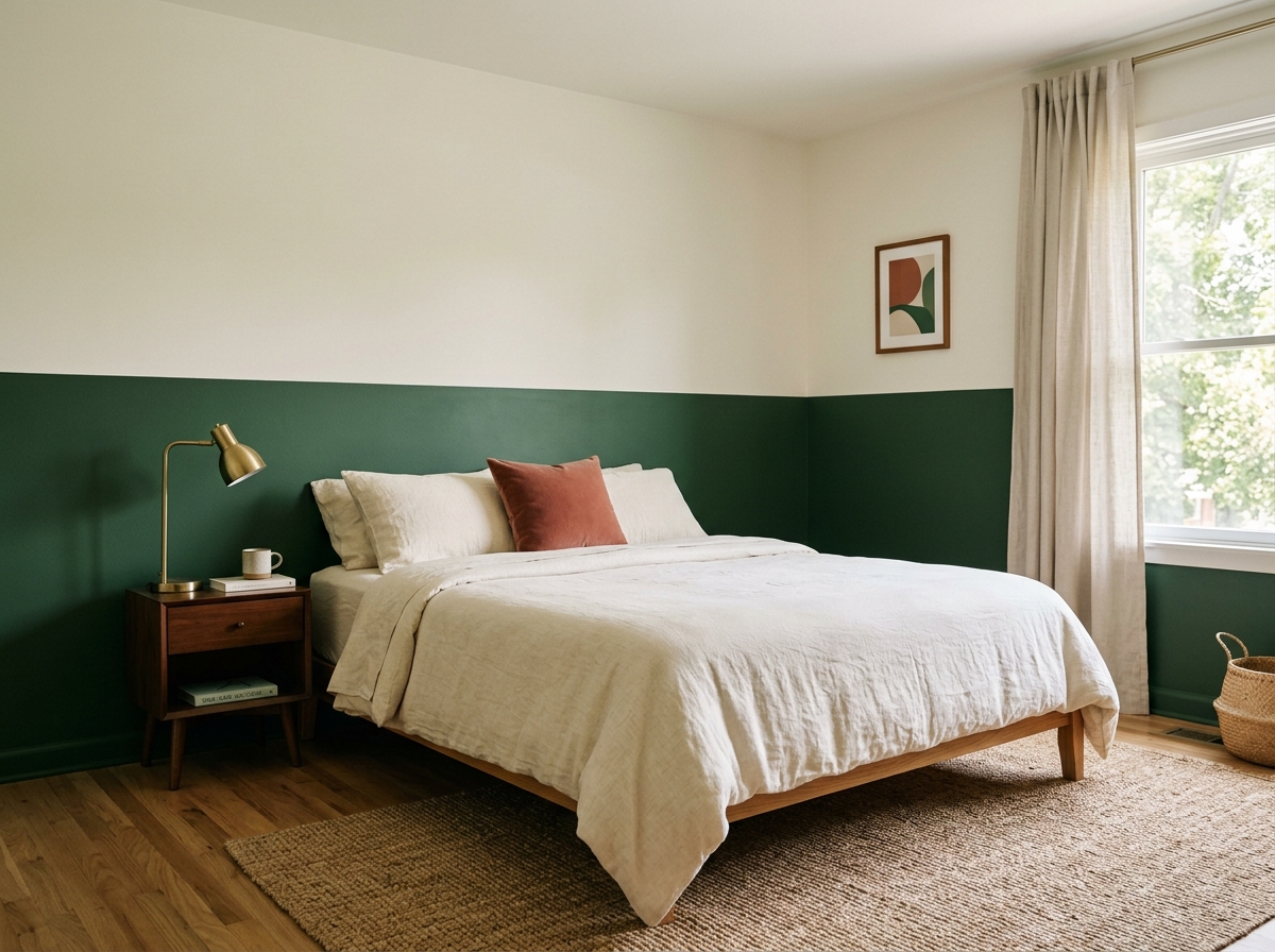
Pictured: An architectural interior photograph showcasing the split-wall painting technique. The lower third of the wall is painted in a rich matte forest green, while the upper two-thirds and the ceiling are finished in a soft, tinted warm off-white.
Dual-Tone Wall Strategy
| Room Feature | Design Strategy | Practical Benefit |
|---|---|---|
| Lower Wall (1/3) | Rich, dark matte shade (Navy/Forest) | Grounds bed frame & hides scuffs |
| Upper Wall (2/3) | Soft tinted off-white | Bounces natural light into the room |
| Ceiling | Match upper wall tint | Removes visual breaks; raises ceiling |
Conclusion: Transform Your Bedroom into a Restful Sanctuary
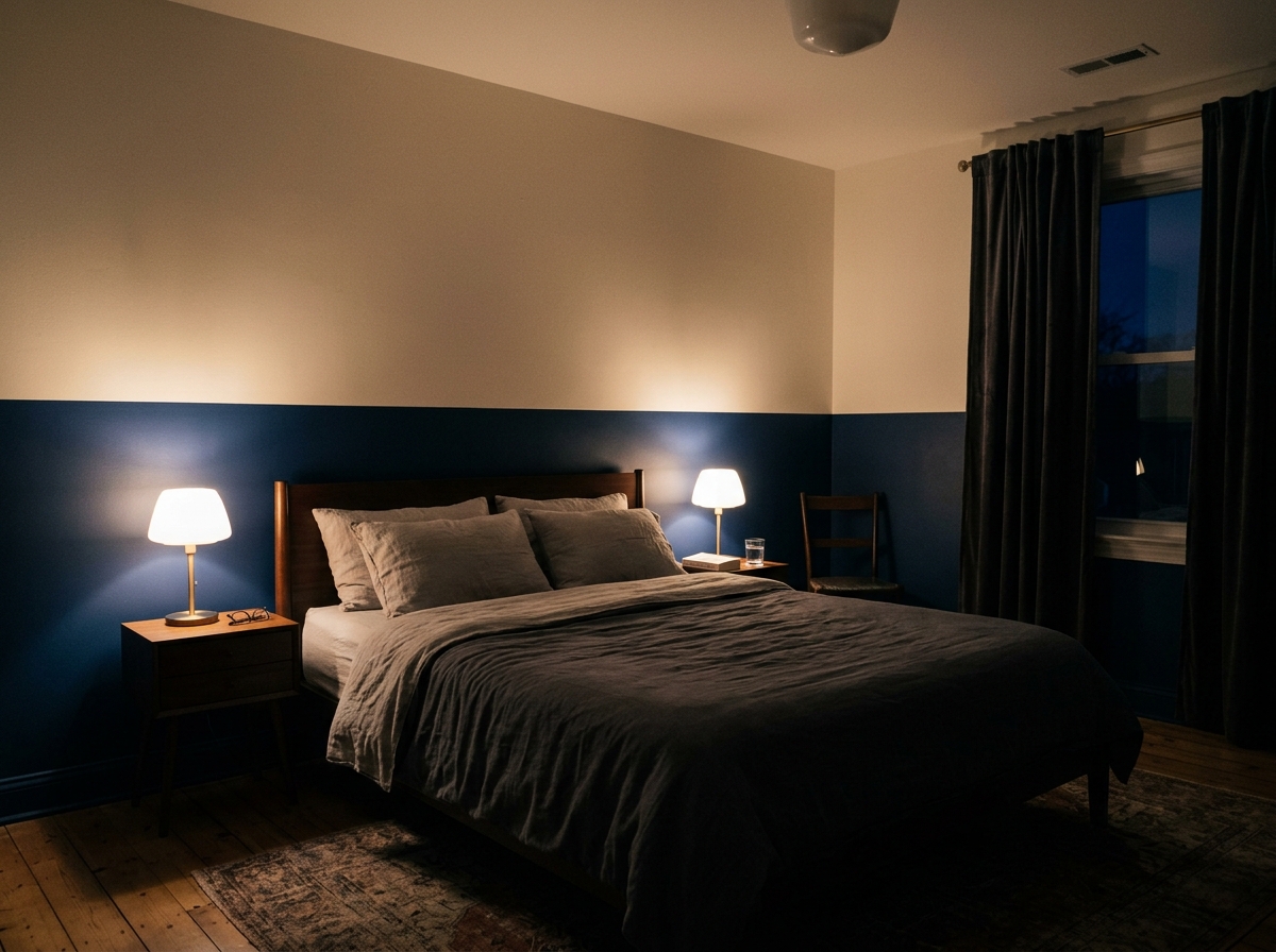
Pictured: An evening interior photograph capturing the bedroom fully prepared for sleep. Daylight has faded, and the two-tone split wall.
Choosing a sleep-promoting bedroom colour does not need to feel overwhelming. By focusing on low-saturation blues, restorative greens, or warm earthy neutrals—and steering clear of high-stimulation reds and deep purples—you can align your decor with your body’s natural circadian biology.
Start small: test two or three A3 paint swatches on your walls, observe how they shift under evening lamplight, and build a layered palette that helps you switch off, relax, and enjoy restorative sleep every night.

fashion-mommy
Welcome to the world of fashion-mommy, a world of fashion, lifestyle, theatre and fun. Enjoy the ride.


